

Formatting chart elements in MS Word elevates data presentation, making it both visually striking and easy to comprehend. If you’re designing a straightforward bar graph or an eye-catching pie chart, smart design choices improve clarity. With just a few clicks, you can customize styles, colors, and labels, transforming your charts into polished visuals.
This article explores the powerful formatting tools in MS Word. You’ll find how to adjust necessary chart elements, including axes, legends, and data series. By the end, you’ll be ready to create charts that not only inform but also engage your audience!
Selecting the Right Chart Type for Your Data
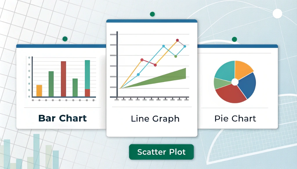
Selecting the right chart type is necessary for impactful data visualization. In MS Word, you can choose from different options, including bar charts, line graphs, pie charts, and scatter plots. Each type serves a unique purpose in presenting data clearly.
Use this quick guide to make your selection:
- Bar Charts: Perfect for comparing quantities across categories.
- Line Graphs: Ideal for illustrating trends over time.
- Pie Charts: Great for showing proportions within a whole.
- Scatter Plots: Excellent for revealing relationships between two variables.
After selecting a chart type, improve its visual presentation using formatting options. Adjust colors, legends, and axis labels to increase clarity. For example, click on a chart element, steer to the Format tab, and explore different styles and templates.
Your goal is to make data engaging and easy to understand, ensuring effective data storytelling.
Understanding Chart Types
Choosing the right chart type is critical for effective data visualization. Each chart serves a unique purpose: bar charts compare quantities, line graphs track trends over time, pie charts display parts of a whole, and scatter plots reveal relationships between variables.
To create impactful charts, use MS Word to format necessary elements like legends, axes, and labels. This enhances clarity and helps your audience easily understand the data. For example, adjusting colors and styles can emphasize key information. For more tips, check out beginner tips on Microsoft Word.
Customizing charts with templates not only ensures consistency but also saves time, resulting in a polished visual presentation. The editing tools in MS Word allow you to modify everything from data series to layout, making your charts both informative and visually appealing.
Grasping chart types and their formatting options is necessary for effective data presentation. By selecting the right chart and customizing it thoughtfully, you lift your data storytelling and engage your audience more effectively.
Choosing Based on Data Visualization Needs
Choosing the right chart type is necessary for fulfilling your data visualization needs. Each chart has a unique purpose: bar charts are ideal for comparing quantities, while line graphs effectively showcase trends over time. Leveraging advanced layout options can improve the clarity and engagement of your charts.
Understanding chart elements like legends, axes, and labels is critical. Each component contributes remarkably to the in general visual presentation. For instance, a well-placed legend helps viewers quickly interpret the meaning of colors. You can customize these elements using different formatting options in MS Word.
Choosing the right colors is critical for effective data storytelling. A thoughtfully selected color scheme boosts both the appeal and readability of your charts. Keep your audience’s preferences in mind when selecting styles. Utilizing templates can streamline your workflow and make sure consistency across your documents.
By carefully selecting chart types and formatting elements, you can remarkably improve your data presentation. With the right tools and techniques, you can create powerful visuals that communicate your data clearly and effectively.
Customizing Chart Elements for Clarity
Customizing chart elements in MS Word is necessary for enhancing clarity in data visualization. Adjusting elements like legends, axes, and data labels remarkably improves chart readability. Begin by selecting the chart element you want to modify, then steer to the Format tab under Chart Tools.
Consider these key formatting options:
- Shape Fill: Change the color or texture of chart elements for better impact.
- Shape Outline: Adjust the border color and thickness to improve visibility.
- Shape Effects: Add shadows, glows, or 3D effects to create depth.
Utilizing effective color schemes and font styles can lift the visual hierarchy of your charts. For instance, using contrasting colors helps key data points stand out. Plus, you can save customized charts as templates for consistent document design in future projects.
By mastering these editing tools, you can craft visually striking charts that communicate information clearly and effectively.
Formatting Axes and Labels
Formatting axes and labels in charts enhances clarity and visual appeal. Begin by selecting the chart element you want to edit. In the Format tab of Chart Tools, options like Shape Fill let you change colors and styles, making your charts more engaging and easier to understand.
Adjusting axis labels is critical for clarity. Following best practices in formatting helps you choose appropriate font styles and sizes, allowing your audience to quickly grasp the data.
- Color Schemes: Use contrasting colors to improve visibility.
- Font Styles: Choose clear, readable fonts for axis labels and legends.
- Data Series: Apply distinct colors or patterns to differentiate data series.
Customizing legends further guides viewers through your data. Right-clicking on the legend opens formatting options to adjust its position or style. This attention to detail in chart customization greatly enhances the in general visual presentation of your data.
Effective formatting of axes and labels is necessary for data visualization. By utilizing the tools in MS Word, you can create charts that are not only visually appealing but also communicate information clearly. Mastering this skill is invaluable for generating reports and delivering presentations.
Adjusting Legends and Data Series
Enhancing charts in MS Word requires adjusting legends and data series. Begin by selecting the chart element you wish to format. Clicking on the chart activates the Chart Tools and the Format tab, where you can use options like Shape Fill to change colors and styles.
Modifying the legend remarkably improves clarity. Right-click the legend to access the Format Legend menu, enabling you to adjust its position, font style, and color scheme. These enhancements increase chart clarity, making data easier to interpret in reports or presentations.
Customizing the data series is similarly simple. Click on any data point, then right-click to format that specific point without affecting others. This feature is ideal for highlighting key data, resulting in a more engaging visual representation.
- Color Schemes: Choose contrasting colors for better visibility.
- Font Styles: Use clear fonts for labels and legends to improve readability.
Effectively using these editing tools can transform a basic chart into a visually appealing and informative graphic. As you explore chart customization, don’t forget each element plays a critical role in conveying your message.
Adjusting legends and data series is critical for creating impactful charts. By leveraging available formatting options, you make sure your charts are not only visually appealing but also communicate information clearly—an necessary skill for effective data visualization in any presentation.
Enhancing Visual Appeal with Design Tools
Enhancing the visual appeal of charts in MS Word is straightforward with effective design tools and formatting options. Simply click on the chart to access the Chart Design and Format tabs, which offer powerful customization features that transform basic graphs into interesting visuals.
Key formatting elements include:
- Colors: Modify the colors of bars or lines to emphasize critical data points.
- Styles: Experiment with different chart styles for a unique appearance.
- Legends: Position legends thoughtfully to improve readability.
- Axes: Adjust axis labels for improved clarity and comprehension.
Using templates can streamline your design process. By selecting a predefined layout, you save time while achieving a professional look. For more insights on chart elements, explore the diverse options available in MS Word.
A well-crafted chart not only conveys data effectively but also captures attention. With the right tools and techniques, you can create visually stunning charts that lift your documents.
Applying Styles and Colors
Improve your charts in MS Word by clicking on the chart to access the Chart Design and Format tabs. These tabs provide a variety of customization options to lift visual appeal.
In the Format tab, you can change chart styles and adjust colors. For example, selecting Shape Outline lets you modify the color, weight, or style of chart elements, while Shape Effects adds unique visual enhancements.
- Chart Elements: Customize legends, axes, and labels for clearer data presentation.
- Templates: Use predefined templates for a consistent design.
- Color Theory: Apply contrasting colors to increase readability.
By utilizing these editing tools, you can transform basic graphs into interesting visual narratives. For advanced formatting tips, explore chart formatting resources.
Focus on establishing a visual hierarchy that guides the viewer’s eye through the data, enhancing both understanding and impact.
Summing up
Enhancing chart elements in MS Word remarkably boosts your data’s visual appeal. Use the Chart Design and Format tabs to easily modify colors, styles, and layouts. A well-designed chart improves clarity and engages your audience effectively. Dedicate time to mastering these tools to create charts that both inform and impress!
Frequently Asked Questions
What are the steps to resize chart elements in MS Word?
To resize chart elements in MS Word, click the chart, select the element, and drag the corners or use the Format tab for precise adjustments.
How can I change the color of chart elements in MS Word?
To change the color of chart elements in MS Word, click the chart, go to the Format tab, and select Shape Fill for desired colors.
How do I change the layout of a chart in Word?
To change the layout of a chart in Word, click the chart, go to the Chart Tools, select the Layout tab, and choose your desired layout option.
How do I add data labels to chart elements in MS Word?
To add data labels, click on the chart, go to the Chart Elements button, and check “Data Labels” for instant visibility.