

Creating pie charts in MS Word is an effective method to visualize data. Pie charts help us quickly grasp the proportions of different segments within a whole, making them ideal for school projects and data analysis. This guide offers straightforward steps to insert and format a pie chart in Word, along with customization tips. Let’s look at data visualization and improve your reports!
Inserting a Pie Chart in MS Word
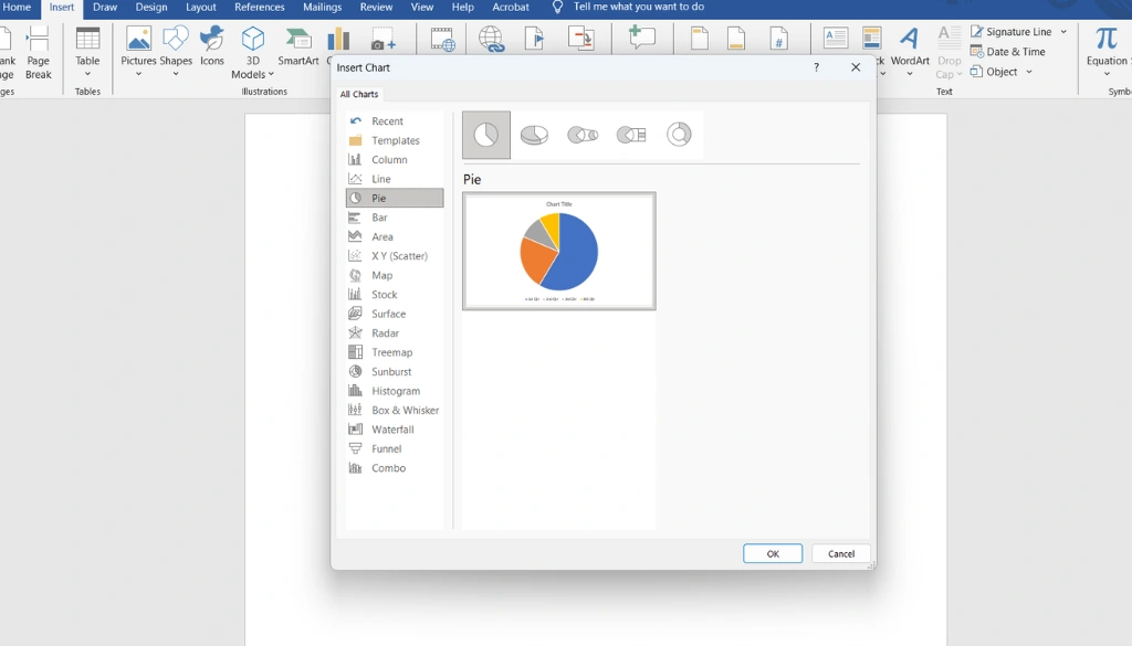
Creating a pie chart in Microsoft Word is straightforward and remarkably improves data visualization. Start by opening your Word document and clicking on the ‘Insert’ tab. Then, select ‘Chart’ from the Illustrations group to open the Insert Chart dialog box. Choose Pie from the chart options available.
Once you select your desired pie chart style, an Excel sheet will pop up for data entry. Replace the default values with your own data, then close the Excel window to view your pie chart in the document. You can further customize your chart using different chart tools in Word, such as modifying colors and adding labels.
If you already have a pie chart in Excel, simply copy it and paste it into your Word document. This integration allows for a seamless presentation of findings in reports or presentations.
Inserting a pie chart not only enhances the visual appeal of your data but also communicates information effectively. With practice, you can master this necessary data visualization tool!
Finding your way to the Insert Tab
To create a pie chart in Microsoft Word, begin by finding your way to the Insert tab on the Ribbon. This tab contains all the tools you need for chart creation. Click on Chart in the Illustrations group to open the Insert Chart dialog box, where you can select your desired chart type.
Choose Pie from the list on the left, then click OK. An Excel sheet will pop up, enabling you to enter your data series. This integration with Excel streamlines the process of visualizing your data.
After entering your data, close the Excel window, and your pie chart will appear in the document. Customization is straightforward; you can modify labels, change colors, and adjust the legend using the chart design options. These features improve your visual representation, making it more engaging and informative for your audience.
Choosing the Pie Chart Type
When choosing the pie chart type in Microsoft Word, focus on how to effectively visualize your data. Pie charts are ideal for showcasing proportions, and they offer different customization options. Begin by finding your way to the Insert tab and clicking on Chart. This opens a dialog where you can select Pie to explore different styles.
Each pie chart type has unique features. A 2D pie chart provides clarity, while a 3D pie chart adds depth. Consider your audience and the message you want to convey. Will they easily understand the differences between slices?
For detailed reports, adding headers and footers can improve comprehension.
- Data Series: Make sure accurate data entry in the Excel sheet that appears after selecting the pie chart.
- Legends and Labels: Include these elements to clarify what each slice represents.
- Chart Formatting: Customize colors and styles to improve visual appeal and understanding.
As you refine your chart, don’t forget Word’s user interface allows for easy adjustments. Tailor your chart to match your document’s design. Whether for a school project or a business presentation, the right pie chart can effectively convey your data story.
Editing and Formatting Pie Charts
Creating and editing pie charts in Microsoft Word is a powerful way to visualize data. Begin by clicking the Insert tab and selecting Chart. This opens the Insert Chart dialog box. Choose Pie from the options on the left and click OK. An Excel sheet will appear, allowing you to replace the placeholder data with your own.
Once your data is entered, improve your pie chart for clarity. Resize it for better visibility and explore different formatting options to lift its design. Change the slice colors, add labels, and adjust the legend to improve comprehension. These secret tips will help you create visually striking graphics.
Integrating Excel data streamlines data analysis and ensures your pie chart accurately conveys the intended information. By leveraging these presentation tools, you can craft impactful visuals that effectively communicate your findings.
Customizing Data Series
Customizing data series in a pie chart is necessary for effective data visualization. In Microsoft Word, you can improve your charts by adjusting colors, labels, and legends. Start by selecting the pie chart and finding your way to the Chart Tools tab, where a variety of formatting options await to transform each slice.
Follow these steps to customize your pie chart:
- Change Colors: Click the Change Colors button to select a color scheme that matches your presentation style.
- Edit Labels: Add data labels for clarity, helping your audience easily understand the information.
- Adjust Legend: Position the legend for maximum visibility, enhancing the in general design.
Also, Excel integration allows for real-time data updates, streamlining report generation and improving both efficiency and accuracy. For additional formatting tips, check out this formatting guide.
By mastering these chart customization techniques, you can create visually striking and informative pie charts that lift your business presentations and reports.
Adding Legends and Labels
Adding legends and labels to a pie chart in Microsoft Word is critical for effective data visualization. These elements clarify each segment’s meaning, making your chart more informative. Use the chart tools in Word to integrate these features effortlessly.
- Insert Chart: Go to the Insert tab, select Chart, choose Pie, and click OK.
- Edit Data: Replace the placeholder data in the displayed spreadsheet.
- Add Labels: Click on your chart, then select Chart Elements to add data labels.
- Customize Legend: Use the Chart Tools to position and style your legend.
By following these steps, you improve the graphical representation of your data, leading to improved data analysis and visual communication. For more formatting options, check out this formatting guide.
Incorporating these elements results in a more engaging and informative chart, critical for effective report generation and business presentations. A well-crafted pie chart not only captures attention but also conveys information efficiently.
Integrating Excel Data for Pie Charts
Creating a pie chart in Microsoft Word is an effective way to visualize data. This circular format makes it easy to grasp proportions quickly. Start by going to the Insert tab and clicking on Chart. Choose Pie and select your desired style. This will open an Excel spreadsheet for data entry.
To integrate Excel data into your pie chart, follow these steps:
- Open Word: Launch Microsoft Word and steer to the Insert tab.
- Select Chart: Click on Chart in the Illustrations group.
- Choose Pie: In the dialog box, select Pie and click OK.
- Input Data: A spreadsheet will appear; replace the default data with your own.
- Customize: Use Chart Tools to adjust labels, legends, and colors.
Integrating Excel data not only ensures accuracy but also enhances your presentation skills. For further insights, check out this guide on pie charts. With practice, you can create compelling data visualizations that support your data-driven decisions.
Copying Charts from Excel
To copy charts from Excel into Microsoft Word, initial create your pie chart in Excel. Organize your data in a single row or column, then select the chart and press Ctrl+C to copy it.
Open your Word document and place the cursor where you want the chart. Press Ctrl+V to paste the chart directly. This integration enhances data visualization, making your reports more engaging. You can also edit the chart’s labels and legend for improved clarity.
Leveraging Excel’s powerful chart tools enhances your data analysis and presentation skills. For step-by-step instructions on creating a pie chart, check out this guide.
Using Excel Data in Word
Integrating Excel data into Microsoft Word enhances your ability to create compelling pie charts. Follow these steps to visualize your data effectively:
- Open Word: Steer to the ‘Insert’ tab.
- Select Chart: Click on ‘Chart’ and choose ‘Pie’.
- Input Data: An Excel sheet will pop up. Enter your data series here.
Once you customize your chart design, it becomes a powerful tool for data analysis and presentation. For detailed instructions on creating pie charts in Excel, check out this guide.
Summing up
Creating pie charts in Microsoft Word is straightforward and enjoyable. These charts effectively visualize data, enhancing clarity and engagement in your reports. By inserting a chart and linking it to Excel data, you can remarkably lift your documents. A well-designed pie chart helps others quickly grasp your information. Keep practicing with these tools to improve your presentations and make your content more informative!
Frequently Asked Questions
How do I edit a pie chart in Microsoft Word?
To edit a pie chart in Word, click on the chart, then use the Chart Tools in the ribbon to modify data, design, or layout.
What are the steps to create a pie chart in MS Word?
To create a pie chart in MS Word: 1. Go to Insert > Chart. 2. Select Pie. 3. Enter your data in the spreadsheet that opens.
How to make a simple pie chart in Word?
To make a simple pie chart in Word, go to Insert > Chart > Pie, select your desired pie style, and input your data in the spreadsheet.
Can beginners easily create pie charts in MS Word?
Yes, beginners can easily create pie charts in MS Word using the Insert tab and following simple steps. It’s user-friendly!