Creating a professional document is about way more than just typing words. The right Microsoft Word document layout is the backbone of everything you write. It takes plain text and turns it into polished, clear, and professional-looking papers that everyone respects. Whether you’re writing a business pitch, a school essay, or a quick internal note, understanding document layout can instantly make your work look fantastic.
A lot of people find Word’s huge layout options super confusing. There are dozens of settings hiding in different tabs, so most users just stick with the default look. They end up missing out on huge chances to make their papers easier to read, keep their brand consistent, and communicate much better. This complete guide walks you through every part of professional Word document layout, from the basic ideas to advanced tricks that will make your documents truly stand out.
By the time you finish this guide, you’ll be a pro at setting page margins, fixing spacing, setting up headers and footers, choosing the best fonts, and following accessibility rules. Plus, we’ll show you advanced tips that transform your basic drafts into amazing documents. Ready to dive in?
Understanding Document Layout Basics
What Is Document Layout?
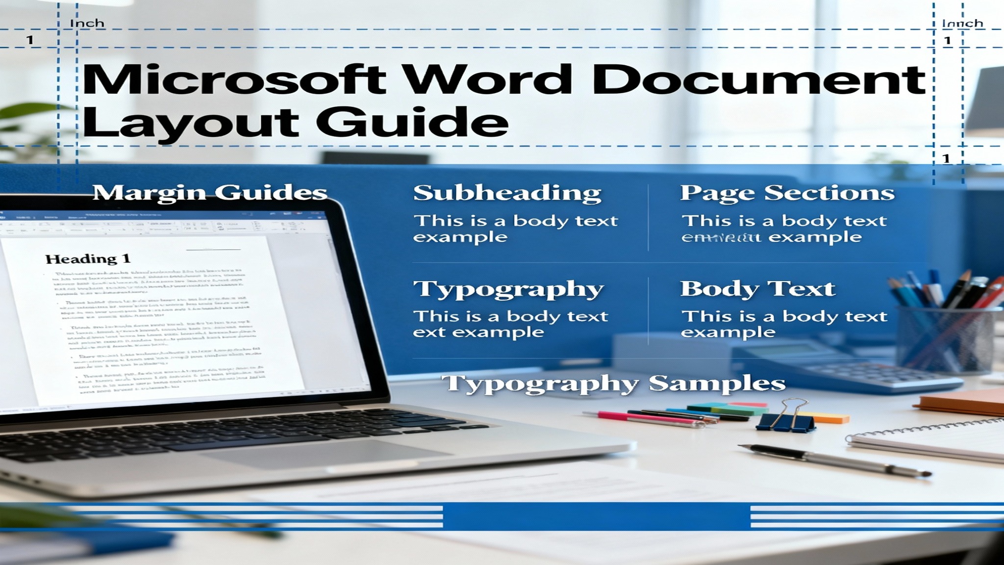
So, what exactly is document layout? It’s how everything looks on the page: the margins, the spacing, the fonts, headers, footers, and how all the text and pictures are organized overall. Think of layout as the “skeleton” holding up your content. It decides how easy it is for readers to move through your document, find key information, and grasp your main point.
The layout includes several interconnected elements:
- Margins: Empty space around the page edges
- Spacing: The distance between lines and paragraphs
- Typography: Your choices for fonts, sizes, and colors
- Page structure: Headers, footers, page breaks, and sections
- Alignment: How the text lines up on the page
- Columns and breaks: Using multiple columns and managing content flow
Think of a document with a bad layout like a totally cluttered room—you immediately feel stressed and can’t find what you need. But a well-designed layout gently guides the reader’s eye, makes information easy to find, and leaves a great, positive impression.
Why Document Layout Matters
Having a professional document layout really affects three major things: how easy it is to read (readability), how much trust people have in your work (credibility), and how well the document works overall (functionality).
Studies on document design show that the right spacing and layout can boost understanding by up to 40%! Good visual organization also helps people remember information better. When clients, bosses, or teachers get your document, they judge it within seconds based on how it looks. A document that has consistent formatting, good spacing, and a clean structure instantly shows professionalism and attention to detail—and those things matter everywhere, from business to school.
Beyond looking good, layout affects functionality. Correct page margins ensure nothing gets cut off when you print. Consistent spacing stops weird formatting problems when you share files. Accessible layouts help readers who use screen readers because they have visual problems.
Setting Page Margins Correctly
Understanding Page Margins
Margins are the blank spaces between your text and the very edge of the page. Default margins in Word are usually set to 1 inch (2.54 cm) on all sides. This gives your paper a professional look while leaving plenty of room for printing, binding (like stapling or putting it in a book), or even handwritten notes.
The four margin types in Word are:
- Top Margin: Space from the top edge down to your header or the first line of text
- Bottom Margin: Space from the last line of text or footer up to the bottom edge
- Left Margin: Space between the left page edge and your text
- Right Margin: Space between the right page edge and your text
Each margin type has a job. Left and right margins control how wide your text is, which affects readability. Top and bottom margins make sure content isn’t chopped off during printing and give the reader some necessary “breathing room.” If your margins are too small, the document feels squished and hard to read. If they are too wide, you waste paper and might look unprofessional.
Predefined vs. Custom Margins
Microsoft Word offers five ready-made margin settings that work great for almost everything:
- Normal (Default): 1 inch on all sides—This is the standard, go-to setting for professional letters, reports, and most documents.
- Narrow: 0.5 inches on all sides—This packs the most content onto the page, useful if you have a lot to say and limited pages.
- Moderate: 1 inch top/bottom, 0.75 inches left/right—A nice, balanced choice often used in school assignments.
- Wide: 1.5 inches on all sides—Creates lots of white space. This is good for documents with heavy design, cover pages, or when you want an elegant feel.
- Mirrored: Uses alternating left/right margins for double-sided printing—This is essential for books, long reports, and documents that will be bound, where the facing pages need to look like reflections of each other.
How to Apply Predefined Margins:
- Click the Layout tab (or Page Layout in older Word versions)
- Click Margins in the left panel
- Select your desired preset from the menu
- Margins apply instantly to your entire document
For most professional documents, the Normal (1-inch) margins remain the best choice. They offer enough white space, fit most printers, and look professional everywhere.
Standard Margins for Different Document Types
Different kinds of documents have specific margin rules that readers expect you to follow:
- Business Letters: 1-inch margins on all sides—This matches standard business letter rules and fits perfectly within typical letterhead designs.
- Academic Papers (APA): 1-inch margins on all sides—APA style strictly requires these measurements for standardization across all subjects.
- Academic Papers (MLA): 1-inch margins on all sides—MLA style also matches the 1-inch requirement.
- Academic Papers (Chicago): 1-inch margins on all sides, sometimes larger for major theses and dissertations—The extra space is often for reader annotations.
- Resumes: 0.5 to 0.75-inch margins—This helps you maximize the space on a single page while still being easy to read.
- Books and Bound Documents: 1-inch left/right, 1.25-inch top/bottom with mirrored margins for binding—This makes room for the binding mechanism and keeps facing pages visually balanced.
Creating Custom Margins
When the preset margins just don’t fit your needs, you can set your own:
Steps to Custom Margins:
- Go to the Layout tab
- Click Margins
- Select Custom Margins (at the bottom of the list)
- In the Page Setup box, type in the exact sizes you want for Top, Bottom, Left, and Right
- Optional: Check Mirror margins for double-sided documents, or check Gutter to add extra space specifically for binding
- Click Set as Default if you want these margins to be your standard for all new documents
- Click OK
Pro tip: If your custom margins are too tiny, Word might warn you, because many printers can’t print closer than 0.5 inches from the edge. Click “Fix” to let Word automatically adjust to your printer’s limits.
Choosing Page Orientation and Size
Understanding Page Orientation
Page orientation just means whether your page is taller than it is wide (Portrait) or wider than it is tall (Landscape). This simple choice hugely changes how your content is displayed and how your document feels.
Portrait Orientation is the default and traditional way—taller than wide (8.5 inches wide × 11 inches tall for standard US Letter). Portrait works best for most documents like letters, reports, resumes, essays, and books because it handles standard text efficiently.
Landscape Orientation is wider than tall (11 inches wide × 8.5 inches tall for standard US Letter). Landscape is perfect for documents that have really wide tables, big spreadsheets, charts, or graphics that need that horizontal room.
When to Use Each Orientation
Use Portrait for:
- Business correspondence and letters
- School papers and essays
- Resumes and job applications
- Reports that are mostly text
- Books and bound documents
- Forms and questionnaires
Use Landscape for:
- Spreadsheets and financial tables
- Project timelines and Gantt charts
- Technical drawings and floor plans
- Presentations and slide materials
- Wide graphs and data visualizations
- Tri-fold brochures
Changing Page Orientation
Steps to Change Orientation:
- Click the Layout tab (or Page Layout in older Word versions)
- Click Orientation in the Page Setup group
- Select Portrait or Landscape
- Your entire document changes orientation immediately
Changing Orientation for Specific Sections: What if you want different orientations in the same document—like portrait pages for text, but a landscape page for a huge table? You need to use section breaks:
- Put your cursor where you want the orientation to change
- Click Layout → Breaks → Next Page
- Move to the new section and change the orientation as described above
- Now, only this new section will have a different orientation
Paper Size and Format
Beyond orientation, you can change the actual size of the page. Standard options include:
- Letter (US Standard): 8.5 × 11 inches—The default for almost all US documents.
- Legal: 8.5 × 14 inches—A bit longer, often used for contracts and legal documents.
- A4 (International Standard): 8.27 × 11.7 inches—Used internationally outside North America.
- A3: 11.7 × 16.5 inches—Double the size of A4, handy for posters or large drawings.
- Tabloid: 11 × 17 inches—Large format for blueprints and design documents.
How to Change Paper Size:
- Click Layout tab
- Click Size in the Page Setup group
- Select from the preset sizes or choose More Paper Sizes for custom dimensions
- The change happens immediately, and your text rearranges to fit the new size
Important: When changing paper size, make sure your printer can actually handle that size. If your printer cannot print near the edges of larger paper, Word may automatically adjust your margins.
Working with Headers, Footers, and Page Numbers
Understanding Headers and Footers
Headers are content that shows up at the top of every page in your document, and footers show up at the bottom. These items usually contain:
- Document titles and chapter names
- Author names or company information
- Page numbers and the total page count
- Dates and document versions
- File names or reference numbers
- Section identifiers or navigation hints
Headers and footers are crucial for professional documents because they give context and keep things consistent across many pages. Readers know right away which document they are viewing and how long it is.
Setting Up Headers and Footers
Adding a Header:
- Double-click at the top center of any page, or go to Insert → Header
- Select a style (Blank, Built-In options, or custom)
- Type your header content (title, author name, etc.)
- Click outside the header area to get back to the main document
Adding a Footer:
- Double-click at the bottom center of any page, or go to Insert → Footer
- Select a style
- Type your footer content
- Click outside to return to the document
Making Headers and Footers Different for the First Page:
Some documents (like reports or proposals) shouldn’t have the same header on the first page:
- Go to Insert → Header → Edit Header
- On the Design tab (Header & Footer Tools), check Different First Page
- The first page header is now separate—you can edit it without changing the others
Making Headers and Footers Different for Odd and Even Pages:
This is for double-sided documents (like books or major reports):
- Access the header/footer area
- On the Design tab, check Different Odd & Even Pages
- Edit the odd and even page versions separately to create “mirror” layouts
Adding Page Numbers and Formatting
Inserting Page Numbers:
- Go to Insert → Page Number
- Choose a location: Top of Page, Bottom of Page, or Page Margins
- Select a style (simple numbers, numbers with chapter info, etc.)
- Click to confirm
Page Number Formatting Options:
- Simple numbers: “1, 2, 3…”
- Numbers with text: “Page 1, Page 2…”
- Numbers with total pages: “1 of 10, 2 of 10…”
- Roman numerals: “i, ii, iii…”
Changing the Starting Number:
- Put your cursor in the section where you want to change the numbering
- Go to Insert → Page Number → Format Page Numbers
- Select Start at and type in the number you want to begin with
- This is helpful for things like appendices or when you combine several documents
Pro Tip: Using the “Page X of Y” format (for example, “Page 3 of 15”) gives readers context for how long the document is. This improves navigation and stops them from feeling lost in long documents.
Mastering Spacing and Typography
Line Spacing and Paragraph Spacing
Line spacing is the distance between lines within a paragraph. Paragraph spacing is the distance between completely separate paragraphs. Both of these really affect how easy your text is to read and how it looks visually.
Line Spacing Options:
- Single (1.0): The least amount of space, good for documents like resumes, where space is limited
- 1.15 lines: Slightly more open than single spacing, common in modern documents
- 1.5 lines: Much more open, greatly improves readability for people with dyslexia
- Double (2.0): A lot of space is required for academic paper,s and allows room for editors to write comments
- Proportional: Space based on the line height, allowing you to fine-tune it
- Fixed: Exact spacing measured in points
Setting Line Spacing:
- Select all text (Ctrl+A) or just the paragraphs you want to change
- Go to Home → Line and Paragraph Spacing
- Choose the spacing you want or select Line Spacing Options for detailed settings
Best Practices by Document Type:
- Business documents: 1.15 or 1.5 lines—This balances being easy to read with using space efficiently.
- Academic papers: 2.0 (double-spaced)—Required by APA, MLA, and Chicago styles.
- Web content: 1.5 to 1.8—Makes text much easier to read on a screen.
- Accessible documents: 1.5 or greater—Crucial for users with visual impairments.
Paragraph Spacing works separately from line spacing and creates necessary breathing room between blocks of ideas:
Setting Paragraph Spacing:
- Select your text
- Go to Home → Line and Paragraph Spacing → Line Spacing Options
- In the Paragraph box, set the Before and After spacing
- Professional standard: 8-12 points before and after paragraphs
Pro Tip: For cleaner layouts, use paragraph spacing settings instead of hitting Enter multiple times to create blank lines. Hitting Enter creates messy, unpredictable spacing. Using the proper settings keeps your document consistent.
Font Selection and Sizing
Choosing your font dramatically influences how professional your document looks. Fonts communicate tone, formality, and brand identity even before readers start reading your content.
Professional Font Categories:
Serif Fonts (Times New Roman, Garamond, Cambria):
- Traditional, formal look
- Great for printed academic papers and formal documents
- Slightly easier to read long text in print
- Show tradition and authority
Sans-Serif Fonts (Arial, Helvetica, Calibri, Verdana):
- Modern, clean look
- Better for reading on screens and digital documents
- More accessible for users with dyslexia
- Show contemporary professionalism
Recommended Font Combinations:
- Professional/Conservative: Times New Roman body (12pt), Arial headings (16pt bold)
- Modern/Tech: Calibri body (11pt), Corbel headings (14pt bold)
- Academic: Cambria body (12pt), Cambria headings (14pt bold)
- Design-Forward: Garamond body (12pt), Corbel headings (16pt bold)
Font Size Guidelines:
- Body text: 10–12 points (11pt is becoming the new standard)
- Heading 1: 16–18 points, bold
- Heading 2: 14 points, bold
- Heading 3: 12 points, bold or italic
- Captions and footnotes: 9–10 points
Avoid These Fonts in Professional Documents:
- Comic Sans—Looks unprofessional and childish
- Decorative/Script fonts—Hard to read at small sizes
- Overly stylized fonts—Distracting and confusing
Font Consistency Rule: Use a maximum of two fonts that work well together throughout your document—usually one for headings and one for the main body text. Consistency makes your work look professional and unified.
Advanced Layout Techniques
Using Section Breaks
Section breaks cut your document into sections that can be formatted independently. Within each section, you can apply different margins, orientation, headers, footers, columns, and numbering—all within a single Word file!
Section Break Types:
- Next Page: The new section starts on the next physical page. Use this when you want major changes, like switching from portrait pages to a landscape page, or changing margins.
- Continuous: The new section starts immediately on the current page without a page break. Use this for column changes or layout tweaks within one page.
- Even Page: Starts the new section on the next even-numbered page (page 2, 4, 6…). Use this for double-sided documents where chapters should always start on the right-hand side.
- Odd Page: Starts on the next odd-numbered page (page 1, 3, 5…). Use for mirrored layouts where opposite pages need different formatting.
Creating Section Breaks:
- Put your cursor exactly where you want the break
- Go to Layout → Breaks
- Select the section break type you want
- The new section now has independent formatting options!
Applying Different Formatting to Sections:
Once you’ve created a section break, formatting changes only affect the section you are currently in:
- Put your cursor in the section you want to change
- Adjust margins, orientation, headers, or columns—they apply only to that section
- Click into a different section to apply different formatting there
- Move through your document, seeing varied formatting as you go
Creating and Using Custom Styles
Styles are pre-set combinations of font, size, color, spacing, and paragraph settings that you can apply with just one click. Instead of manually formatting every single heading or list, styles keep your document consistent and make global changes simple.
Word comes with built-in styles (Heading 1, Heading 2, Normal, List Bullet, etc.). While those are helpful, custom styles let you create formatting combos specific to your company’s brand or your own unique needs.
Creating a Custom Style:
- Format a paragraph exactly how you want it (font, size, color, spacing, bold, etc.)
- Select that paragraph
- Go to Home → Styles → Create a Style (or right-click in the Styles pane)
- Give your style a name (e.g., “Client Name,” “Important Alert,” “Sidebar Text”)
- Choose whether to store it only in this document or in your personal template
- Click OK
Modifying Existing Styles:
- Right-click a style in the Styles gallery or Styles pane
- Select Modify
- Adjust the font, size, spacing, color, and other settings
- Check Automatically update if you want this style to update everywhere instantly whenever you change one instance
- Click OK—all text using this style updates instantly throughout your document
Style Benefits:
- Consistency: All headings look identical without manual effort.
- Efficiency: Apply complicated formatting with just one click.
- Scalability: Change a style once; every place it is used updates automatically.
- Accessibility: Using proper, semantic styles helps screen readers navigate documents easily.
- Table of Contents: Automatic TOC generation requires the use of heading styles.
Creating Multi-Column Layouts
Some documents look better in multiple columns, such as newsletters, brochures, flyers, and magazines. While Word isn’t the best tool for complex page layout (designers prefer tools like InDesign), Word columns work well for papers that are heavy on text.
Creating Columns:
- Select the text you want to put into columns (or select all for the entire document)
- Go to Layout → Columns
- Choose ready-made layouts (One, Two, Three columns, etc.) or select More Columns for custom settings
- In the Columns box, you can adjust:
- How many columns are there
- The space between columns
- The column width
- Whether to apply it to just your selection or the whole document
- Click OK
Column Formatting Tips:
- Text automatically flows down one column, then wraps to the next column.
- For newsletter looks, use 2–3 columns for best readability.
- Insert column breaks (Layout → Breaks → Column) to control exactly where text jumps to the next column.
- Images can span multiple columns to add visual interest.
- Make sure there is enough space between columns so they are readable.
Limitations of Word Columns:
Word columns work best for documents that are mostly text. For complex layouts involving images, text boxes, and very precise positioning, you are better off using dedicated design software like Microsoft Publisher or Adobe InDesign.
Accessibility and Professional Best Practices
Ensuring Document Accessibility
Creating documents that are accessible benefits all readers, but it is absolutely essential for users with disabilities. Accessible layouts work well with screen readers, magnification software, and help readers who have difficulty with vision or reading.
Accessibility Best Practices:
- Use Proper Heading Hierarchy: Don’t skip heading levels (never jump straight from Heading 1 to Heading 3). Screen readers rely on the correct order to help users navigate.
- Maintain Sufficient Color Contrast: Make sure you use black or dark text on white or light backgrounds so it is easy to read. Avoid light gray text that strains the eyes.
- Use Sans-Serif Fonts: Sans-serif fonts like Arial and Verdana are easier to access than decorative fonts, especially for users with dyslexia.
- Minimum Font Size of 12pt: Never go below 10pt for the main text; 12pt is quickly becoming the standard.
- Adequate Line Spacing: Use 1.5 or greater line spacing to help users with visual impairments.
- Alt Text for Images: Every image needs descriptive alt text (right-click image → Edit Alt Text) so screen readers can tell blind users what the image shows.
- Use Built-in Lists: Use Word’s proper bullet and numbered list tools (don’t manually type dashes or numbers) so screen readers can correctly identify the list structure.
- Hyperlink Text: Use descriptive text like “Read more about accessibility” instead of just “Click here.” Screen readers often read links one after another.
- Avoid Tables for Layout: Only use tables to display data. Do not use tables to create multi-column layouts, as screen readers struggle to understand table-based layouts.
- Sufficient Margins and White Space: Text that is cramped with tight margins is hard for people with low vision and those with cognitive disabilities.
Common Layout Mistakes to Avoid
Even expert Word users make simple mistakes that hurt the professionalism and functionality of their documents. Knowing and avoiding these errors ensures your papers maintain high quality.
Mistake #1: Using Multiple Spaces or Tab Stops Inconsistently
Problem: Hitting the space bar repeatedly to line up text or create indentation leads to unpredictable spacing when the document is opened on different devices.
Solution: Use Word’s dedicated Tab Stop feature (Home → Paragraph → Indents and Spacing) for reliable alignment. Or, use tables with invisible borders for perfectly aligned layouts.
Mistake #2: Creating Space with Blank Lines
Problem: Pressing Enter multiple times to create space between sections breaks the document flow and causes big formatting headaches when text is added or deleted.
Solution: Use the Paragraph Spacing (Before and After) settings instead. When text is edited, paragraph spacing adjusts automatically.
Mistake #3: Formatting Individual Words Instead of Using Styles
Problem: Manually bolding every heading creates inconsistency. If you later decide all headings should be blue instead of black, you have to change each one separately.
Solution: Use Heading styles consistently. Change the style once, and all headings update throughout the document instantly.
Mistake #4: Using Decorative or Serif Fonts for Online Documents
Problem: Decorative fonts and fancy serifs often look bad on screens and are harder to read in digital formats.
Solution: Use clean sans-serif fonts (Calibri, Arial, Verdana) for digital documents and online viewing. Save traditional serif fonts for papers that will be printed.
Mistake #5: Cramped Margins and Insufficient White Space
Problem: Tiny margins and minimal spacing create visual clutter, making the text hard to read and looking very unprofessional.
Solution: Keep margins at least 1 inch. Use appropriate line spacing (1.15 minimum) and paragraph spacing. Remember, white space helps your professional documents look better.
Mistake #6: Ignoring Accessibility Principles
Problem: Documents without alt text, correct heading hierarchy, or enough contrast exclude users with disabilities and might violate legal accessibility standards.
Solution: Use proper heading hierarchy, add descriptive alt text to all images, maintain color contrast, and use fonts and spacing sizes that work for all readers.
Mistake #7: Inconsistent Formatting Across Pages
Problem: Margins, fonts, spacing, and styles that constantly change confuse readers and signal a lack of professionalism.
Solution: Apply styles consistently throughout your entire document. Use sections and templates to keep your formatting uniform.
Frequently Asked Questions
Q1: What’s the best margin size for professional documents?
A: The standard professional margins are 1 inch (2.54 cm) on all sides. This is the default in Word and works for business letters, reports, and most professional papers. Only use Narrow (0.5″) if you absolutely need to save space, and Wide (1.5″) for high-design documents or if you want a more elegant look.
Q2: Should I use single or double spacing for my document?
A: Line spacing depends on what you are writing. Single spacing (1.0) is right for business documents and anything where space is tight. Double spacing (2.0) is required for academic papers and gives editors room to comment. For general readability, 1.15 or 1.5 spacing is a great middle ground.
Q3: How do I make my header and footer different on the first page?
A: While editing your header or footer, go to the Design tab (Header & Footer Tools) and check the “Different First Page” box. You can then edit the first page header/footer without changing the rest of the document.
Q4: Can I use different margins in different parts of my document?
A: Yes! Insert a section break (Layout → Breaks → Next Page) right before the spot where you want the margins to change. Then select that new section and adjust its margins independently. Only that specific section’s formatting will change.
Q5: What fonts should I avoid in professional documents?
A: Avoid Comic Sans, decorative fonts, and overly stylized scripts in professional settings. These fonts look unprofessional and hurt your credibility. Stick to clean fonts like Times New Roman, Arial, Calibri, or Cambria.
Q6: How do I create a table of contents automatically?
A: Make sure you use the proper Heading styles (Heading 1, Heading 2, etc.) throughout your document. Then go to References → Table of Contents and select a style. Word will automatically build the TOC from your headings.
Q7: What’s the difference between section breaks and page breaks?
A: A page break (Ctrl+Enter) just moves you to the next page while keeping all the current formatting. A section break creates a brand new section with its own controllable formatting—this is essential when different parts of your document need different orientations, margins, or headers.
Q8: How do I make my document mobile-friendly or screen-reader compatible?
A: Use proper heading hierarchy, add descriptive alt text to images, maintain good color contrast, use sans-serif fonts, ensure adequate spacing, and use Word’s built-in formatting tools instead of manual alignment. Avoid using tables just for layout purposes.
Q9: Can Word create complex page layouts like a magazine or brochure?
A: Word has basic layout abilities, but for really complex professional designs, Microsoft Publisher or Adobe InDesign are better choices. Word is best for standard document styles (reports, papers, letters) rather than publications heavy on design.
Q10: How do I save my custom margins and formatting as defaults?
A: After customizing margins and formatting, go to Layout → Margins → Custom Margins. In the Page Setup box, check “Set as Default” before clicking OK. These margins will then become the standard for all new documents you create.
Conclusion
Microsoft Word document layout isn’t just about making things look nice—it’s a crucial part of professional communication that truly affects readability, credibility, and functionality. Everything matters, from setting the right margins to mastering fonts, implementing headers and footers, and ensuring accessibility. Every layout decision affects how clearly your document communicates.
The journey from being a document beginner to a layout expert means understanding why each element is important (margins stop printing errors, proper spacing improves readability, and styles ensure consistency) and then applying these rules systematically. Start with the basics: set 1-inch margins, choose professional fonts, and apply consistent spacing. Then move to advanced techniques like section breaks and custom styles that give your documents a sophisticated, polished appearance.
Remember that a great layout doesn’t require complex design skills. It requires consistency, attention to white space, and a commitment to accessibility. Whether you’re preparing a business pitch, a school essay, or an internal report, applying the principles in this guide ensures your documents look professional, communicate clearly, and reach all your readers effectively.